Your basket is empty
Victoria + Albert x Wallpaper*
Modern Movements In Colour: Architecturally Inspired Palettes.
Architecture styles of the 20th century inspired the new collection of colour palettes by Wallpaper* and Victoria + Albert. Editor-in-chief Sarah Douglas looked to the tonal ranges employed by Belgian minimalists, the splashes of primaries in Brazilian modernism and the colour-popped chromatics in American postmodernism, adapting and reimagining shade and hue for the contemporary bathroom environment. Your journey into modern ‘bathitecture’ begins here.
“Bathrooms are sanctuaries; extremely personal spaces where you need to feel calm and serene. These colour palettes were influenced and inspired by architecture and the sculptural forms of the Victoria + Albert designs.”
Sarah Douglas, Editor-in-chief, Wallpaper*


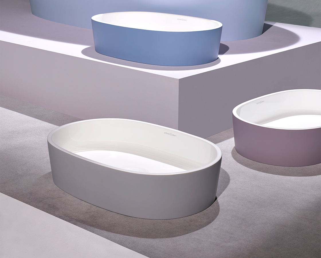
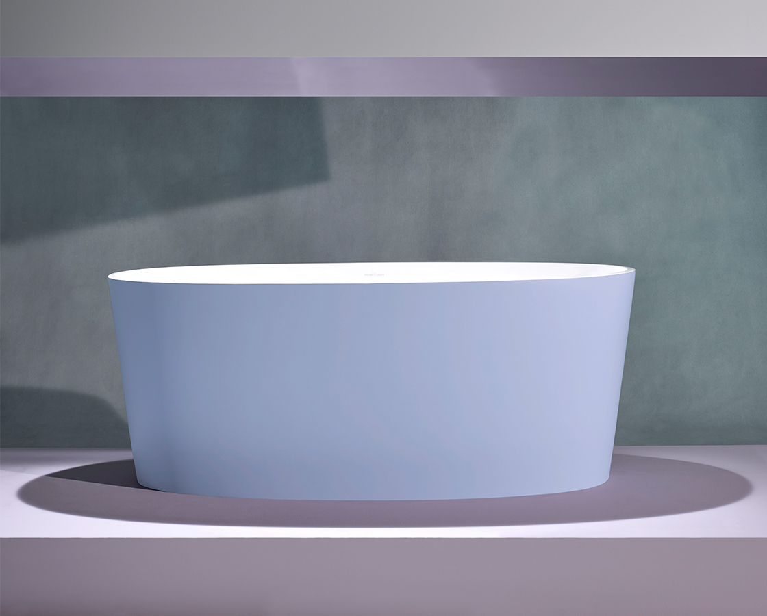
Belgian Minimalism
This subtly nuanced palette creates a gentle ambience across a bathroom.
Referencing the Belgian minimalist movement in design and architecture, this subtle colour palette is inspired by the works of architects Leon Stynen and Juliaan Lampens. Incorporating cool, calm, soft colours – light blues, linen-like pastels, stone and slate greys – the tonal range of the Belgian Minimalism palette references raw and untreated materials and has a minimising, focusing effect. By removing attention from objective form and turning attention to the essence of the surrounding environment, this subtly nuanced palette creates a gentle ambience across a bathroom.
View the full palette here.
Brazilian Modernism
A thrilling, pioneering movement in contemporary South American architecture and design informs the Brazilian Modernism palette.
Referencing the work of mavericks Lina Bo Bardi, Paulo Mendes da Rocha and Oscar Niemeyer, the Victoria + Albert and Wallpaper* Brazilian Modernism spectrum comprises rich, deep colours – greens, earth tones, glass-brick blues – as well as concrete and translucency. Bo Bardi’s combination of brightness and brutalism was an inspiration – particularly the Italy-born innovator’s use of red accents and architectural detail breaking out of large areas of industrial grey concrete that introduces contemporary, graphic playfulness to the smooth rendered mass.
View the full palette here.
American Postmodernism
A palette that is confident, industrial, dramatic, and fearlessly contrasting.
The work of Frank Gehry, Philip Johnson, Michael Graves, Robert Venturi and Denise Scott Brown – the pluralism, irony, paradox and contextualism of American postmodernism – all contribute to a palette that is confident, industrial, dramatic, and fearlessly contrasting. Think monochromatics with pops of colour – steel, graphite, grey, black, with soft gold, green glass. America’s postmodernist buildings embrace colour like no other architectural movement, giving façades variety and personality through the deployment of coloured glass, ceramic tiles, or stone – an aesthetic sensibility that can be adapted and applied to the bathroom.
View the full palette here.
Discover the collaboration
Learn more about the collaboration between Victoria + Albert and Wallpaper*, and the story behind the curated colour palettes, by downloading a copy of our swatch booklet.
Photography: William Bunce